-
Jan 27, 2015, 08:09 PM
#1
The Robert Lighton Quartet
I made a promise to Henry the other day to show off my collection of Robert Lighton watches, so I will take advantage of a snow day and make good on that promise.
Robert Lighton is a furniture designer who tried his hand at designing watches around 2003 or so. It was an interesting lineup of classically styled watches mostly named after New York landmarks. Most of the watches used a Soprod-modified movement based on the 2892. In addition to being modified to use sub-seconds, the movements are nicely finished and gold plated (I know I popped the case on one of them, but I must not have taken any photos).
The watchmaking venture was shut down in 2009 and the watches were sold at a substantial discount. I fell for several of the models and built up a little collection of these beauties.
From left to right, I present the Empire, the San Remo, the Growler, and the Hudson.

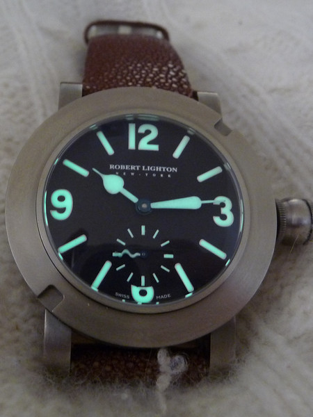
I'll start with the oddest of the bunch: the Growler. The Growler is based on a WWII-era Longines canteen-style dive watch. Other than an actual canteen-style crown, the case is almost a dead ringer for the original. Picture of the Longines borrowed from the internet.

The Growler.

Obviously, the handset was a whimsical departure from the original, and it was the serpentine seconds hand that drew me to this model.
It uses a highly domed sapphire crystal making photographing the watch challenging and rewarding at the same time.


The hands are one of the strongest design features of all Robert Lighton models, the Growler no exception to this rule. In the following picture, you can actually see that even though the hands are covered in lume, they started life as flame blued steel.

The lume on the Growler is also nicely done.
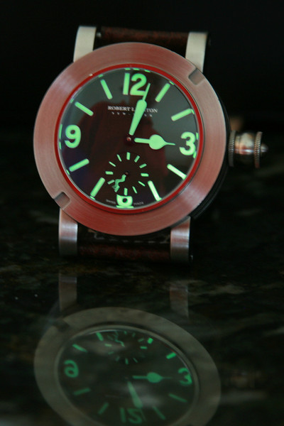
The Growler actually came in two different versions. The most common was made in stainless steel, but a few were made of titanium. I tried the stainless steel model and it was ridiculously heavy, so I found a titanium model to replace it. You can tell the versions apart by the S or T in the serial number engraved on the back. The Growler also has the distinction of being the only model with an engraved caseback. All other Robert Lighton models had plain casebacks in a nod to an era when casebacks were often personalized.

The titanium model does have one drawback. The screwed down crown often gets stripped. I am currently in the process of finding a place to have mine fixed.
To be continued...
Addendum: I neglected to mention that the Growler came with a thick, goat leather strap and a milled square tang buckle. I've had it on the stingray strap for so long that I almost forgot what it originally wore.
Last edited by FuzzyB; Jan 27, 2015 at 09:15 PM.
-
Post Thanks / Like - 9 Likes
-
Jan 27, 2015, 08:12 PM
#2
I look forward to the close ups of the outside 2 - they look sweet 
-
Post Thanks / Like - 1 Likes
-
Jan 27, 2015, 08:14 PM
#3
-
Post Thanks / Like - 1 Likes
-
Jan 27, 2015, 08:14 PM
#4
Fantastic! Can't wait to see more
-
Post Thanks / Like - 1 Likes
-
Jan 27, 2015, 08:16 PM
#5
That's a brute of a watch 
The sub-seconds hand should annoy the hell out of me, but it doesn't; I love the quirkiness of it 
Some people have opinions - The rest of us have taste.
-
Jan 27, 2015, 08:28 PM
#6
-
Post Thanks / Like - 10 Likes
-
Jan 27, 2015, 08:29 PM
#7
Bone Collector


Loving the Hudson on the far right, please sell it to me 
-
Post Thanks / Like - 1 Likes
-
Jan 27, 2015, 08:43 PM
#8
I like blue 
Some people have opinions - The rest of us have taste.
-
Jan 27, 2015, 08:50 PM
#9
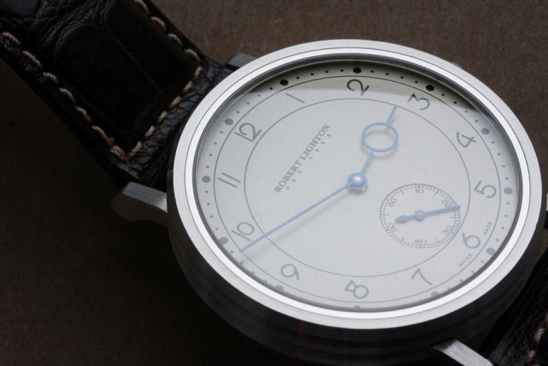
Part III - The San Remo
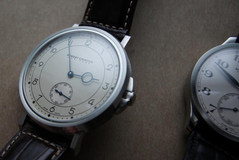
Where the Empire is the understated beauty of the bunch, the San Remo exudes style without being too overbearing.
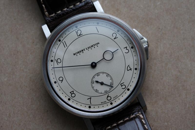
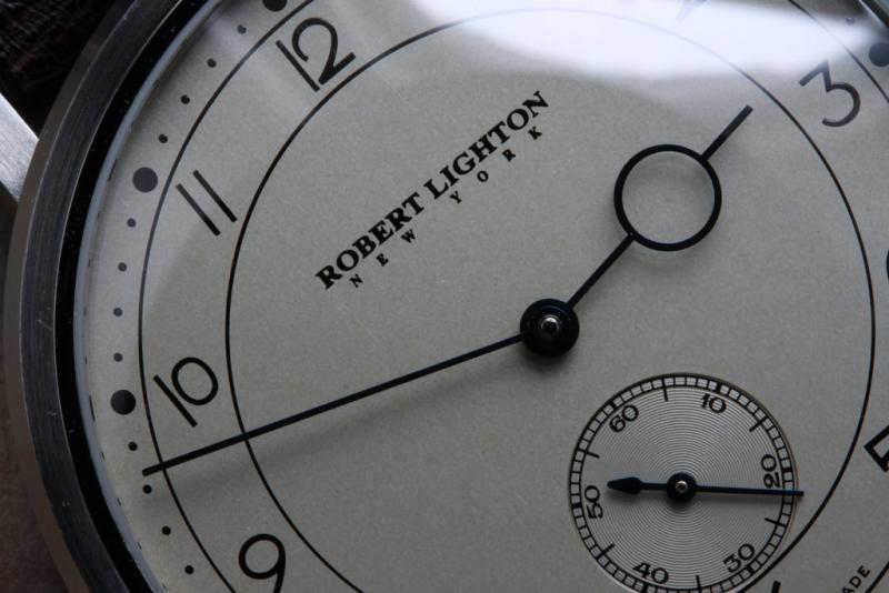
The San Remo is pure art deco. From the hands to the fonts to the case. I think it works because it didn't overlook any of these features. The hour hand is the first to catch the eye with its large open circle. Art deco does Breguet hands. The font is lovely yet restrained.
The dial of the San Remo is also unique in both its texture and material. I believe, but cannot confirm, that the dial is silvered due to the coloring. It catches the light and can vary from almost white to silver to pale yellow. The contrast between the dials is apparent when compared to the white dial of the Empire. (The following picture is terrible, but it does show the difference in appearance well.)

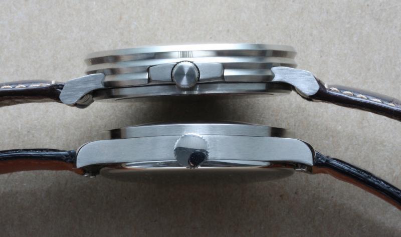
A nice touch on the San Remo is the bezel. Rather than being entirely brushed or completely polished, there is a thin polished ring adjacent the crystal and the remainder of the bezel is brushed.
Up until now, the photos have shown one of the most distinguishing features of the San Remo: the case. Although not unique (I believe there is an Audi design watch that uses a similar profile), it is certainly unusual. However, it completes the art deco theme of the watch. (The Empire is on the bottom in the following photo.)

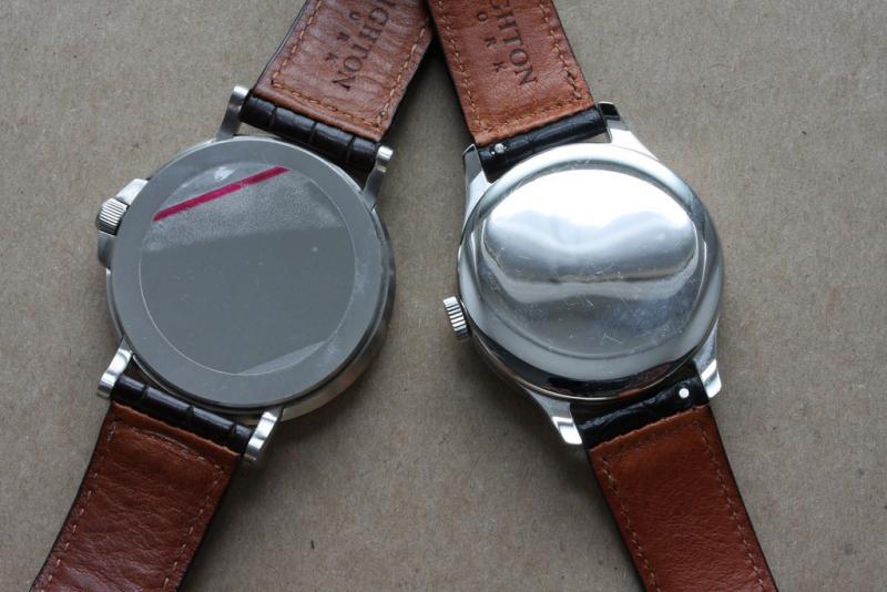
Again, a plain caseback. In keeping with the remainder of the watch, the caseback of the San Remo is brushed. (I took this photo shortly after receiving the San Remo and in my excitement, I forgot to take off the sticker.)
With the possible exception of Max Bill, the San Remo has perhaps the best looking "4" I have seen on a watch.
Last edited by FuzzyB; Jan 27, 2015 at 09:13 PM.
-
Post Thanks / Like - 7 Likes
-
Jan 27, 2015, 08:56 PM
#10

Originally Posted by
FuzzyB

With the possible exception of Max Bill, the San Remo has perhaps the best looking "4" I have seen on a watch.
Favourite comment ever
-
Post Thanks / Like - 1 Likes


 Likes:


 Reply With Quote


