-
Nov 23, 2014, 01:50 AM
#1
Member


What's going on with the new indices on the JLC MUT Small Seconds?
I love the watches that JLC produces. My favorites are from its Master Ultra Thin collection. But I always felt that they got their indices slightly wrong, especially on the Small Seconds. Lets look at the previous model, and then we'll take a look at the current iteration.
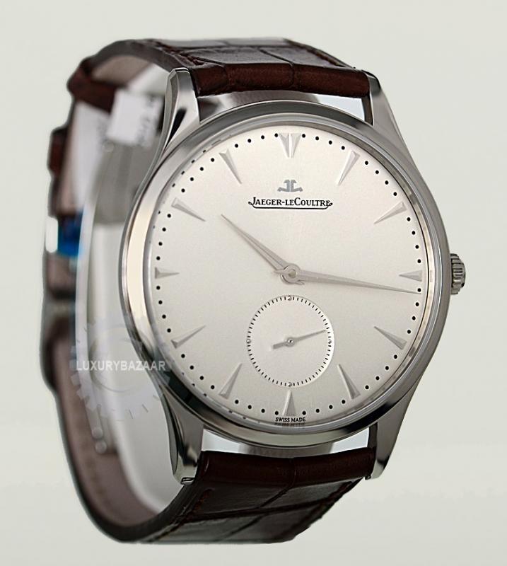
Okay. So, what's up with the tiny indices at 3 and 9? Why aren't they the same size as the ones at 1, 2, 4, 5, 7, 8, 10, and 11? Obviously the index at 6 needs to be smaller because of the small seconds complication, which I think is well integrated. And the double-index at twelve doesn't really bother me because it balances out the one at 6 and most of what's going on in the dial exists in the vertical plane anyway, so it gives the dial some balance. But, what's the reason for 3 and 9? Side note: These same small indices are at 3 and 9 on JLC's perpetual calendar because of the subdials, which works great. Let's look at their current model:
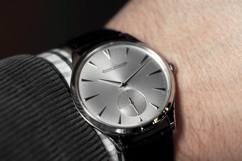
Whoa, JLC. I said they needed to be a bit bigger, but now yous is actin' all crazy. They all seem to be different sizes. Going clockwise, 12 and one seem the same, but they continually increase in size as they reach the case sides. 2 is a bit bigger, 3 is the big daddy index, and then back down to 4, and even a bit smaller for 5. 6 is its same cute self. I don't know how I feel about this choice. Is it unique? Certainly. Is unique a good thing in the watch world, especially when slight and classy? No doubt. But, and this question may be more important, does it distract and take away from the sheer simple beauty of the watch? Verdict's still out.
So what does the IWL community think?
Does it look better? Worse? Just different?
Am I correct in all of my statements because I have a keen eye for design?
Do I have to find something better to do with my time than contemplate horologic minutiae of watches that I don't even own? I'd like to hear some thoughts on the matter.
-
Post Thanks / Like - 1 Likes
 Rob
Rob liked this post
-
Nov 23, 2014, 02:03 AM
#2
The watch watcher

I personally like the new version, at least in the picture. It gives a sense of symmetry that works even without the sub-seconds dial.
-
Nov 23, 2014, 03:07 AM
#3
Member

I like the newer model over the previous. I would prefer all the same size except for smaller at 6 (obviously) and double at 12.
-
Nov 23, 2014, 08:00 AM
#4
This is the first time I've seen the new one and I really like it. Would like to see it from more straight on so I can really see the gradations of size.
-
Nov 23, 2014, 09:15 AM
#5
Member

I still like it and would love to own it obviously but I have to agree that the dial looks somewhat more aggressive. I prefer the previous model myself.
The Nomos Orion for example looks far more elegant.
-
Nov 23, 2014, 04:08 PM
#6
What's going on with the new indices on the JLC MUT Small Seconds?
I prefer the previous model as being more consistent with the shorter dagger markers JLC has used since before it was JLC. The shorter indexes at 3 and 6 provide a symmetry beyond just side-to-side and top-to-bottom. JLC has a long tradition of treating the ordinal markers differently from those in between.
The newer one is going after a different symmetrical concept, but the markers do seem a bit long.
Rick "whose 1945 JLC has painted numerals at the ordinals and short applied dagger markers in between" Denney
Last edited by Rdenney; Nov 24, 2014 at 01:22 AM.
More than 500 characters worth of watches.
-
Nov 23, 2014, 04:22 PM
#7
Yeah, they buggered that up a treat in my opinion. The old dial worked nicely, with the 3 and 9 balancing with the 6.
I would not consider buying the updated version.
G-Shock: GW3000B-1A
Rolex: Submariner 14060M
Accurist: 1961 Shockmaster (Gold) & 1965 Shockmaster (Steel)
Omega: Speedmaster Professional 3570.50.00
Meistersinger: Perigraph AM1002
Ben Sherman: S489.OOBS
Rotary: 1990 Quartz (Gold)
Steinhart: Ocean GMT 39mm
Certina: DS Super PH500M & DS PH200M
Timex: MKI Mechanical
-
Nov 23, 2014, 04:40 PM
#8
Member
I understand the aesthetic they were going for, and it may look good on one of their other models, but I think it detracts from the simplicity of the watch.
-
Nov 24, 2014, 10:25 PM
#9
Member
I like the old version.
The smaller markers at 3:00 and 9:00 look perfect to me.
That's a gorgeous watch btw.


 Likes:

 Reply With Quote


