-
Mar 31, 2015, 09:06 PM
#11

Originally Posted by
geoffbot

Strong bump. It's nice enough...you're right about the date wheel font though, though I probably wouldn't have noticed had you not pointed it out....
Using the search function is lot more pleasurable when it feels like a treat rather than a moral obligation 
That font looks more in place on the C9:
-
Mar 31, 2015, 09:20 PM
#12
Member


I really like the black dial/green bezel model, looks great.
But polished centre links puts me off. I would go for the 38mm model, but that I feel is too small for a dive watch
-
Apr 1, 2015, 08:44 AM
#13
Member

I like the new date window placement but that logo really kills it for me.
The old one was better, "Chr.WARD" is so out of balance I could never live with it.
I feel a knot in my stomach just looking at it now!
OCD much ......
Chris
Ω Seamaster
3

-
Apr 1, 2015, 08:50 AM
#14
Member

I never liked the hands and that hasn't changed for me.
Regards Cam
Watches
Tudor Pelagos, Omega Speedmaster 3510.50, Oris 1965 Diver, Tissot Visodate, Junghans Max Bill Auto, Helson Blackbeard, Seiko PADI Turtle, Tag Heuer F1
-
Apr 1, 2015, 01:24 PM
#15
It's just a bit...eh...isn't it?
-
Apr 4, 2015, 10:00 AM
#16
I was browsing on the CW forum again, and discovered they have a thread for photos of this one watch: http://christopherwardforum.com/view...p?f=58&t=30504 Probably better that I give that link than continually steal their photos 
-
Aug 22, 2015, 06:53 AM
#17
-
Post Thanks / Like - 2 Likes
-
Aug 22, 2015, 11:03 AM
#18
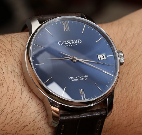
Amazing fact: the initial photos had a white date wheel. The Christopher Ward Forum said, en masse, AAAARGGGGHHHH. Immediately CW took note, took the decision to use a black date window, took the ads down, and reworked the renders: http://www.christopherwardforum.com/...art=45#p475723
-
Post Thanks / Like - 1 Likes
-
Aug 22, 2015, 11:05 AM
#19
Note something about these watches: flat dial. None of those of waves bobbing up and down!
-
Aug 22, 2015, 02:06 PM
#20
Originally Posted by
Der Amf
Note something about these watches: flat dial. None of those of waves bobbing up and down!
It's very attractive, except for the vintage-y looking lume.


 Likes: 6


 FuzzyB liked this post
 Posting Permissions

 Reply With Quote


