


 Likes:


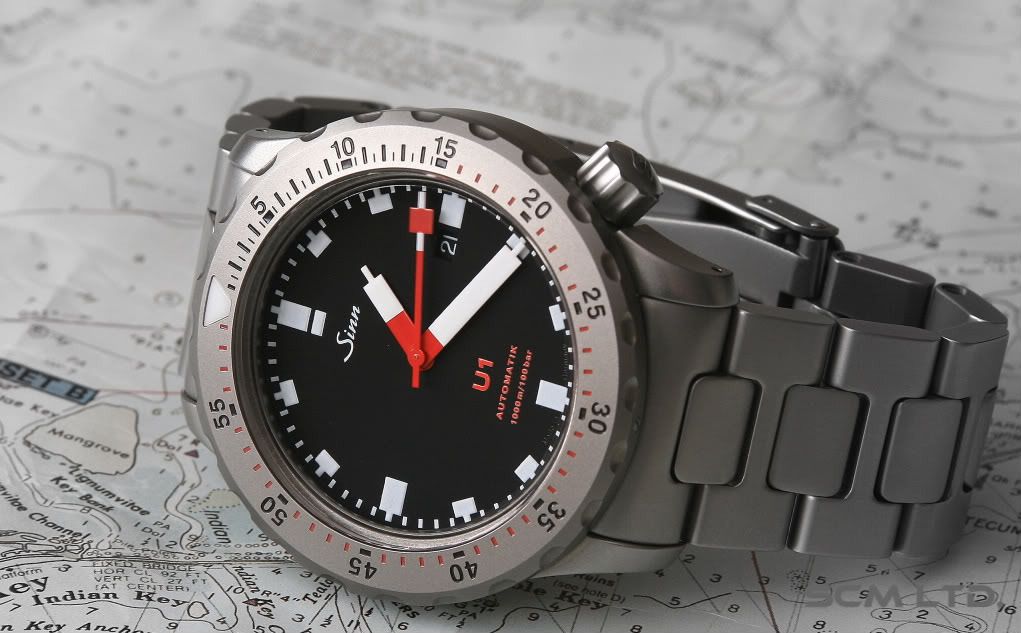
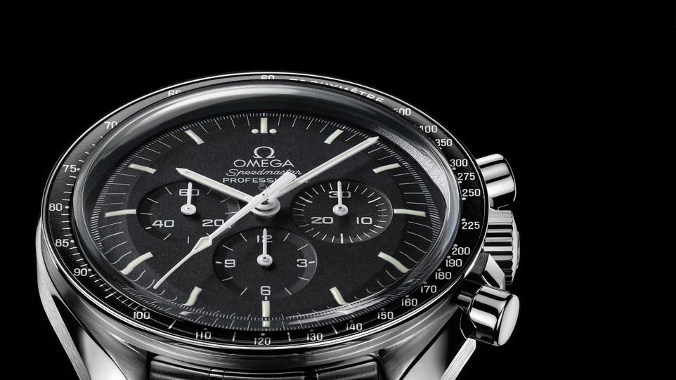
When purchasing a watch sometimes this becomes a factor in one way or another. On one hand I love the utility look of the dials of watches such as the U1 and Speedmaster and I very well may have both in my collection at some point soon. These are just examples but these kind of dials sometimes leave me umm...
a bit flat.
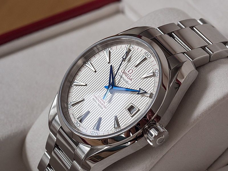
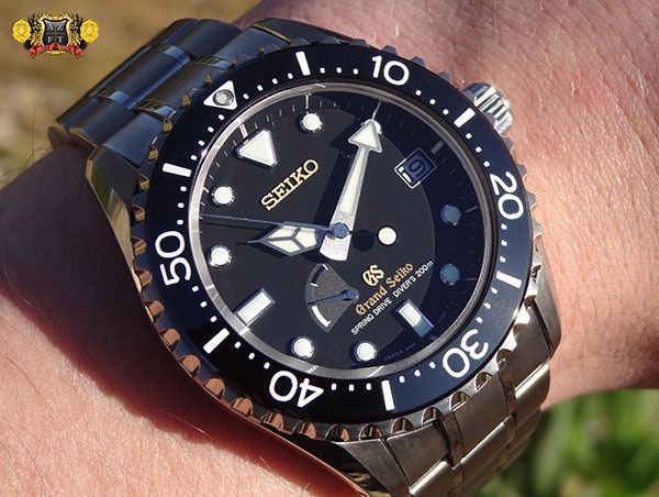
As much as I love their casework and style there is something to be said with dials of more dimension, 3D effect, things that "pop" or whatever you want to call it. Whether its the beautifully raised logo on a Grand Seiko or the intricate pattern of the dial of an Aqua Terra. The raised indices and other texts, it just seems very interesting to me. Looking at these kind of dials at different angles and lighting just seems a little more alive sort to say while flat dials with painted logos, texts and indices have a more clinical effect that could possibly be a bit more boring perhaps?
For me, its the overall package but of course the added detail is a nice touch. I come to second guess myself with such classics as the Speedy or U1 and other great watches with flat dials. Would I appreciate it more if it had more detailed indices, depth to the dial or raised texts? I don't think so. These are a classic and future classic watch the way they are exactly, in their own right so I guess not. How does everyone else feel about flat dials vs dials with more dimensions? These brands and models and just examples as many watches have or don't have these features.

 Reply With Quote