


 Likes:


Long time readers will recall that way back in the summer of 2016, Zach went on hands-on with a curious watch from a small Dutch brand, Richardt & Mejer. The Signature, their initial quartz offering, was a well priced timepiece with a decidedly unusual case design, with angles and geometry that we simply dont see in most modern watches. Now, Richardt & Mejer is back with the Automatisk line. Theyre still distinctly Dutch, but now with an upgrade to a mechanical movement they target a slightly different consumer and have tweaked their design just a little, while remaining true to what the brand founders recognize as a shared Scandinavian design heritage.
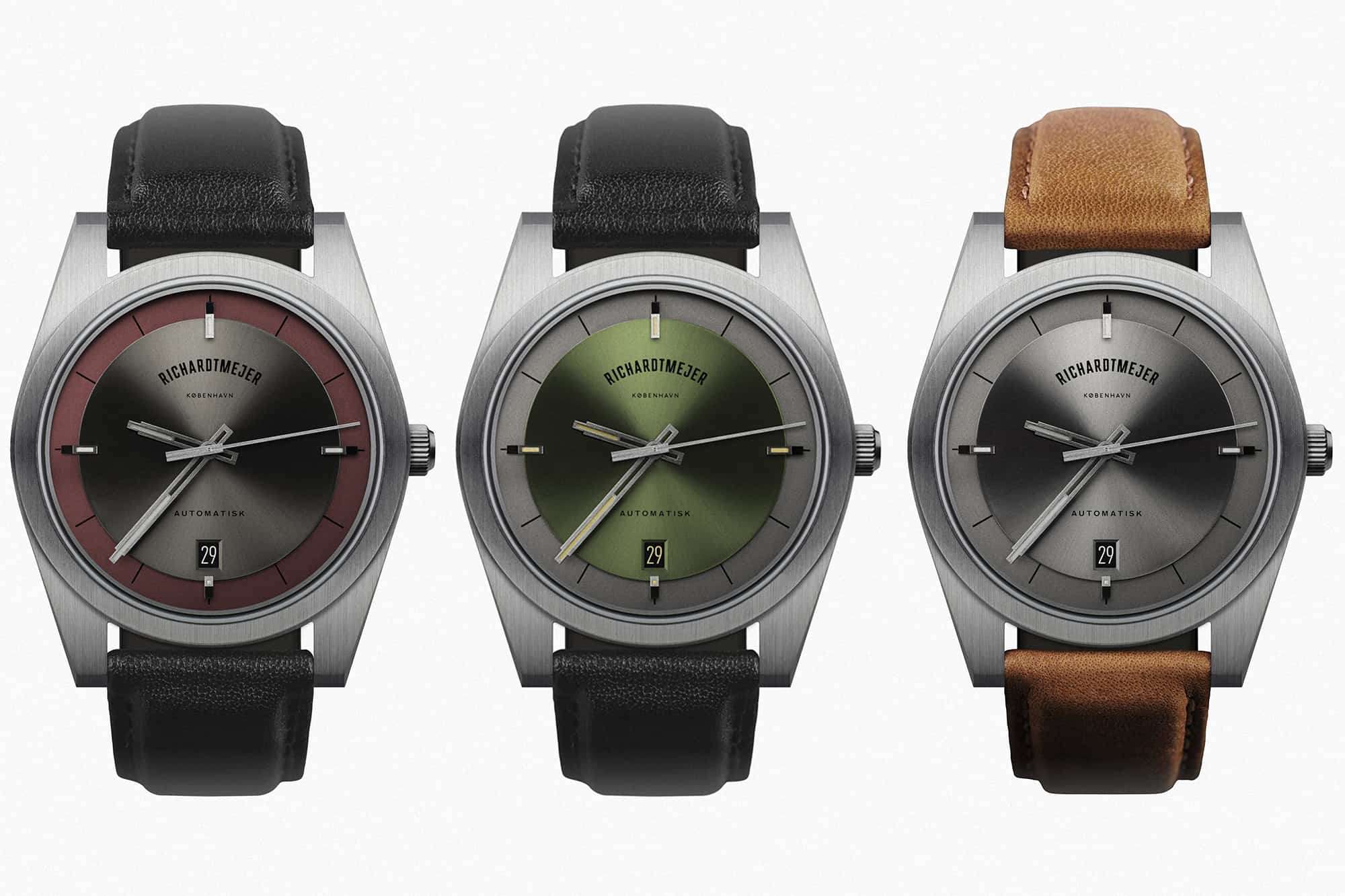
Richardt & Mejer Automatisk
- Case Material: Stainless steel
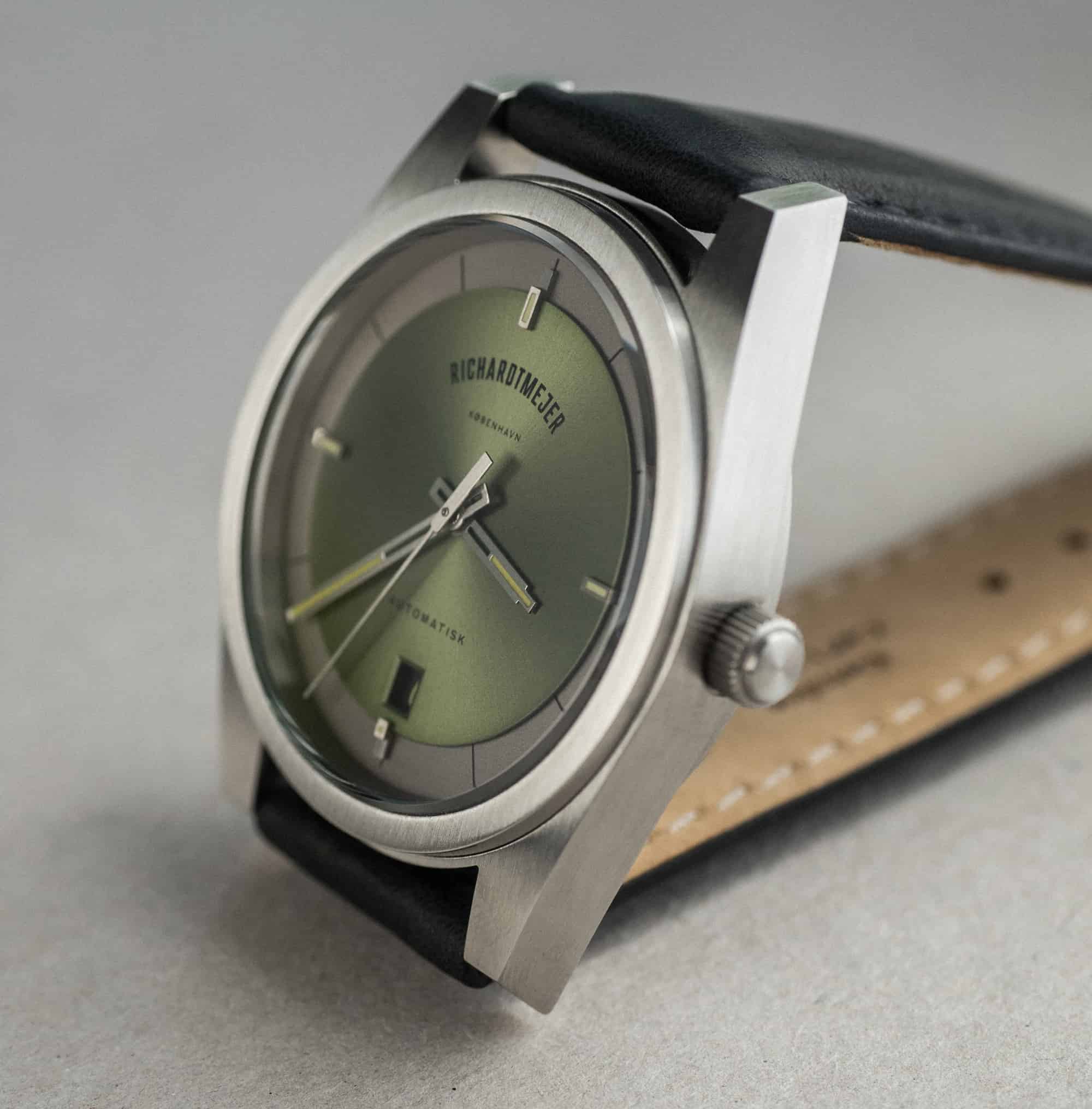
- Dial:*Layered moss, plum, stone
- Dimensions: 38.5mm x 11mm
- Crystal: Sapphire (front and back)
- Water Resistance: 5 ATM
- Crown: Push/pull
- Movement: Swiss Made Automatic movement Cal. STP1-11
- Strap/bracelet:*Calfskin
- Price: $700
- Expected Release: Available for pre-order soon
The Automatisk is definitely an evolution of the Signature in its case design. The latter is more aggressively angled, while the new mechanical piece is softer in the case band lines. Where the signature verged really close to a pure rectangular shape, I think the Automatisk is more easily recognizable as what we traditionally think of as a watch. There are still plenty of sharp angles on the Automatisk, but theyre mostly reserved for the lugs, which drop off dramatically at all four points. The case finishing is brushed all over, giving the watch a cool, almost instrument-like aesthetic. I wouldnt call it a tool watch though, as the design is most definitely form first, function second.
There are currently three dial variants available: moss, plum, and stone. All feature an inner circular section containing lumed hour markers at 12, 3, 6, and 9, and a well executed date window at 6. I wish the plum version followed the moss and used the burst of color as the main event, rather than an accent, but scrolling through the Richardt & Mejer catalog, I think theres a strong possibility we could see additional fun colorways using this basic design in the future. The stone version is the most austere, with both sections of the dial in a gray that seems to match the case itself.*
With so few watch brands coming out of this part of the world, its easy to get caught up in the Scandinavian design part of the story, but I would encourage readers to evaluate the watch on its merits at least as much as its geography. This is not, after all, the Ikea watch, and it doesnt look like a Volvo either, and it certainly doesnt look like any of the other watches coming out the region. The Automatisk is a completely viable and interesting option regardless of where it comes from. Good design is good design, and if you like an ultra modern look in an easy to wear form factor at under $1,000, theres a lot of charm to be had in the Automatisk.*Richardt & Mejer
Images from this post:
The post Introducing the Richardt & Mejer Automatisk*Collection appeared first on Worn & Wound.


More...


 Reply With Quote