-
Member

As a segue to the chronograph legibility question...
I'd like to take a poll on white on black vs black on white dials and hands.
Do you prefer the look of a Speedy with white hands on a black dial or the opposite look of the Damasko?
.
.
.

Retired from Fire/Rescue January 2019 with 30 years on the job

-
White hands-black dial for me.
The Damasko black on lumed white looks jarring to my eyes, almost brutal.
-
-
I find white on black more legible and easier on the eyes.
I don't know if you're familiar with xterm, but I used to have to use it at work all the time. When I learned to change the settings within the terminal, I was able to change it from black text on a white background to white text on a black background. I could literally feel my eyes relax when I looked at the terminal and my eye fatigue went way down.
-
Member

White/light hands on dark dial please...
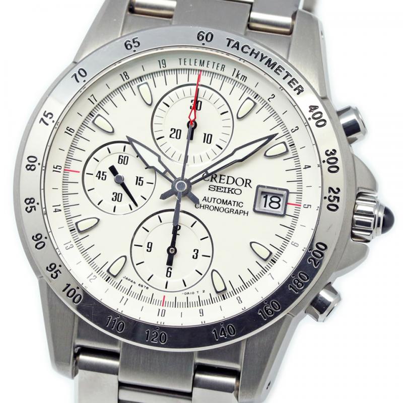
Personally I find light dial chrono to be less legible
Case in point is speedy pro vs alaska and pam 250 vs 251
-
Member
I realize I should have added "Undecided" and "Like them both" to the poll choices. Please write that response in your post if need be.
.
.
.
Retired from Fire/Rescue January 2019 with 30 years on the job
-
-
White on black as a general preference but...
-
Post Thanks / Like - 2 Likes
-
In general I find myself wearing light-dial watches more often. Black hands with center lume on a white or silver dial are more visible to my crappy eyesight. Having said that, chronograph dials tend to be rather busy and I'll go with whatever is clear and uncluttered, regardless of colors. I have sen good and bad examples in both combinations.
Too many watches, not enough wrists.
-
Jul 10, 2019, 05:04 PM
#10
I like both but only just favour white hands on black dial
Sent from my iPhone using Tapatalk


 Likes: 5


 Posting Permissions

 Reply With Quote


