-
Alpinist arrival
File under modestly spectacular. Field watch simplicity, but the granulated ombré dial makes you give it a second, and third, look. The contrasting colour of the hands and numerals is stylishly effective rather than odd. Charcoal and ochre is a nice combination. And its nice to have a Seiko with a name, even if Alpinist is nowhere to be seen. I dont mind the Prospex X. An affordable watch with character, and more sophistication than you might associate with an outdoor activity type of watch. A bit like an Explorer...
The Explorer vibe may be stronger than ever (no compass bezel and a printed dial), although Im not sure that the Alpinist was ever Seikos answer to the Explorer. The Alpinist and Explorer have always been different, and the Alpinist looks all Seiko to me. The early Explorers were made in quite small numbers, the Alpinist was made for the Japanese, and the Alpinist is actually a bit older than the classic 1016.
Id never quite bought an Alpinist until now (colours a bit rich, not sure about the compass), but this one is bang on.
Great size - 38mm x 12.9mm. Nice movement (6R35) with 70-hour power reserve. More than enough quality. Cheaper than most things.
I cant show it to advantage like this (from Fratello) -

but here are a few early shots -
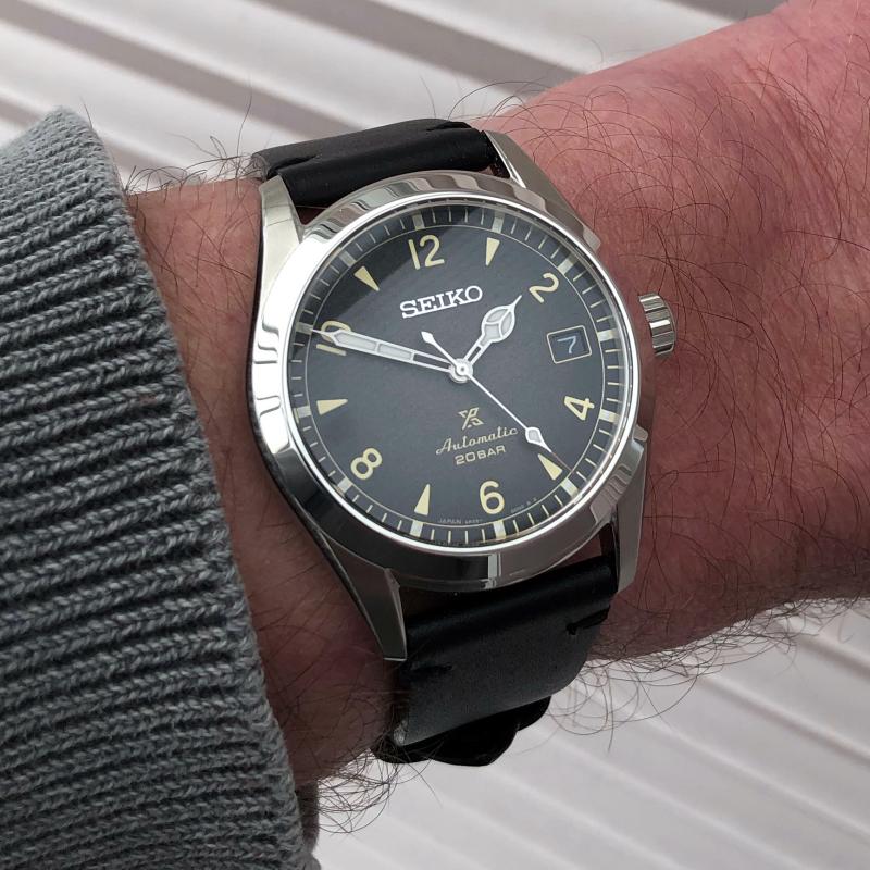

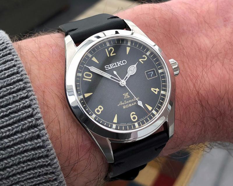
Youll see that the dial texture isnt as pronounced as in some studio photos, but you do see it at some angles. The strap has one of Seikos wrong way round deployants, with the tail facing towards you. I dont know if I can get used to that or not - I havent before. Its a shame, because the strap and deployant are very good apart from that.
But Im very pleased. 
-
Post Thanks / Like - 17 Likes
 hayday
,
Strela167,
rodia77,
happyscrappyheropup,
OrangeSport,
mlcor,
wschofield3,
Greg,
Mediocre,
gnuyork,
stew77,
is that my watch,
Fantasio,
Jose G,
Matt,
earl of farnborough,
iyonk liked this post
-
I've always liked the Alpinist but I'm generally against compass bezels. I have a Timex Expedition with one but that has a digital compass so it works. On a fixed bezel, not so much. Not to my eyes, anyway. The Alpinist looks great now that they've dropped the compas bezel. The blue dial is veeeery tempting. I quite like that.
Last edited by hayday; Apr 7, 2021 at 08:23 PM.
Once in awhile you get shown the light in the strangest of places if you look at it right.
-
Congrats, you finally have a 


Originally Posted by
tribe125

The Explorer vibe may be stronger than ever (no compass bezel and a printed dial), although Im not sure that the Alpinist was ever Seikos answer to the Explorer. The Alpinist and Explorer have always been different, and the Alpinist looks all Seiko to me. The early Explorers were made in quite small numbers, the Alpinist was made for the Japanese, and the Alpinist is actually a bit older than the classic 1016.
I don't think there's any evidence whatsoever that the Alpinist was 'Seiko's answer'. I'd think in many people's minds it became a 'poor man's Explorer' simply because it was a more affordable watch of a similar type. Switch the price tags and the Explorer becomes a poor man's Alpinist.
Youll see that the dial texture isnt as pronounced as in some studio photos, but you do see it at some angles. The strap has one of Seikos wrong way round deployants, with the tail facing towards you. I dont know if I can get used to that or not - I havent before. Its a shame, because the strap and deployant are very good apart from that.
If you want to capture the grainy texture, try to shoot a few pics in direct sunlight rather than soft light. The strap -- just switch the sides at the lugs?
-
Originally Posted by
rodia77
Congrats, you finally have a

Originally Posted by
rodia77
don't think there's any evidence whatsoever that the Alpinist was 'Seiko's answer'.
Me neither, but I’ve seen it said by writers who should know better.
Originally Posted by
rodia77
The strap -- just switch the sides at the lugs?
Tried that, about a minute after taking it out of the box. As expected, the respective ends of the strap were wrong, with the clasp over to one side.
At the moment, I am kind of getting used to Seiko’s configuration, which is a pleasant surprise. It’s probably because the tail is tucked away under my wrist.
-
Post Thanks / Like - 1 Likes
-
Savagely Average

Like that color so much more than the green!
-
Lovely watch! I like my old green one, but then, it's not for everyone. I had one of those backwards-deployants on a Cocktail Time that I eventually sold to a friend. I could get used to it easily enough, but I never really liked it to be honest. I tend to prefer a simple tang buckle, although I still have ... mmmm I think three deployants left in my collection because they din't bother me.
Too many watches, not enough wrists.
-
-
Post Thanks / Like - 1 Likes
-
I must say when this was announced, I instantly wanted one, but the Explorer was going to take that role for me, but now that it's discontinued, I'm not sure. On paper the Seiko in nearly perfect, maybe even more perfect than the current and last gen Explorer - printed dial, 38mm, etc. and I actually prefer the even numerals to the 3/6/9. I like no dates, but the reality is a date is very practical, and I could take it or leave it. I need to scratch that Rolex itch though.
Congrats. Let me know when you are ready for a "cheeky offer" 
-
Originally Posted by
gnuyork
Congrats. Let me know when you are ready for a "cheeky offer"
Yes, its like an Explorer that you might actually wear when doing some exploring.
-
Apr 9, 2021, 12:52 PM
#10
Originally Posted by
tribe125
Yes, it’s like an Explorer that you might actually wear when doing some exploring.
Shame they don't make it in two-tone steel and gold
-
Post Thanks / Like - 1 Likes


 Likes:


 Reply With Quote


